header-ew

ExpenseWire

ExpenseWire is an online expense management system. It provides employees with the ability to create expense reports online, allowing them to submit and approve expense reports and get reimbursed.

Platforms: Web and native mobile.

Company: Paychex, Inc.

Overview

Project Brief

The new feature, “Credit Card,” will allow users personal or corporate credit card payment options for their travel and discretionary spending. This new function is designed to enhance the streamlined reporting and documenting workflow and the overall management experience.

Project Scope

The scope of this project is focused on the design of the UX process and implementing this new feature, “Credit Card,” into the current application, be it desktop and/or mobile. 

The Problem

More and more people use credit cards instead of cash for their travel and business expenses. A solution that can help these credit card users manage and document their expenses is urgently needed.

The Challenge

Mobile and desktop are two different frameworks. Older mobile frameworks will experience difficulty adapting to the new solutions. For example, the enhancement for mobile, in this case, is based on MVP.

Design a streamlined process for the desktop user and admin when the user is on the “Credit Card” screen. Therefore, switching between the user and the admin requires a method when the user has the admin role.

My Mission

Solving and supporting the new feature by providing a UX solution that meets all the requirements and criteria. Providing a streamlined process for users to manage and create reports.

The Team

Working  within an agile team as the primary UX designer, I’ve worked with both the Product Owner and business analyst to brainstorm critical functionalities and requirements. Sketching solution concepts, created icons, documenting UX behavior rules, and prototyping the final product.  

Tools

Sketch
InVision
Jira (UX document)

The Process

Analysis

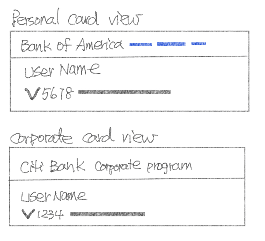
The existing credit card information is located in “Admin” under each person’s account, enabling editing of the individual credit card information. To meet the new feature’s criteria, a new tab within the main navigation titled “Credit Card” will be required.


The mobile version of this new feature is MVP; therefore, there is no admin feature.
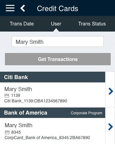
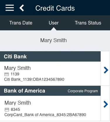
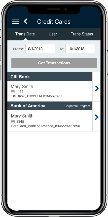
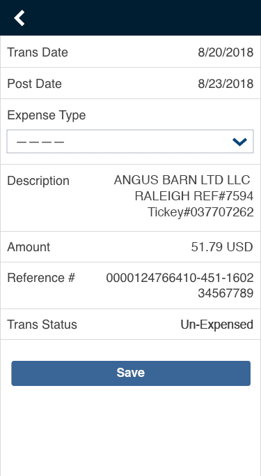
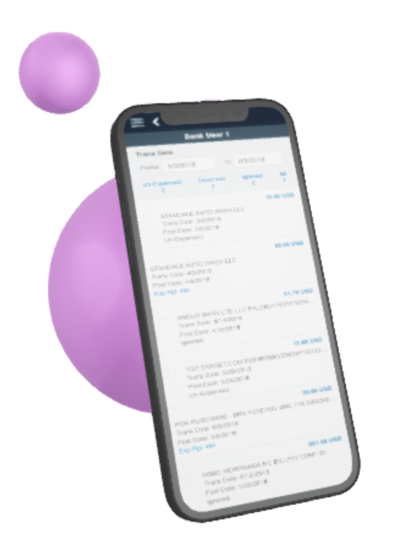
> View mobile version 

DESKTOP VERSION

The user and admin interface with their hierarchy and requirements.
The user and admin have different management requirements, therefore, the hierarchies are different. So, I have included the following steps to my design process.

Sketch the Concept

1. Research the right solution
The data display in this feature is solely for card transactions. In order to find a viable solution, I have searched and explored other banking and credit card related interfaces to acquire my inspiration. 

2. The user and admin view scenarios: How to switch them?
One of the foremost issues is the method of switching the two views. This will impact the layout for each section. Therefore, I proposed three methods of switching styles. They are as follows:

  1. The toggle method.
  2. The dropdown selection method.
  3. The tab method. 

After the feedback from the product owner and other team members, we settled on the tab method option.

1. Outline each hierarchy with requirements for both user and admin views.

The user view outline: It is required to display the information for the credit card (card level) as well as the card’s detailed transaction (detail view level). (Desktop and mobile)

The admin view outline: It is required to display the information about the bank (bank-level), the card/user (card level), and the card’s detailed transaction (detail view level).

2. sketch out each hierarchy’s components with new and existing requirements. Usually, I will find questions, missing information or functionality issues in this step.

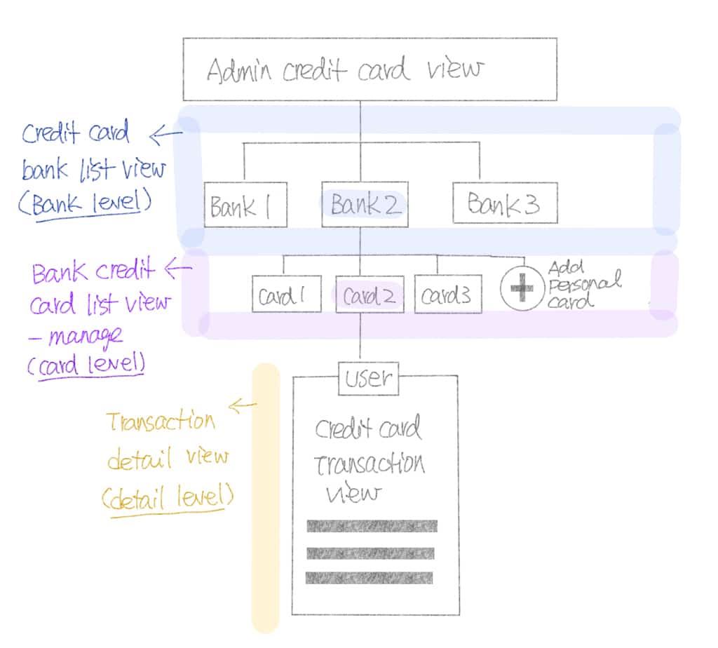
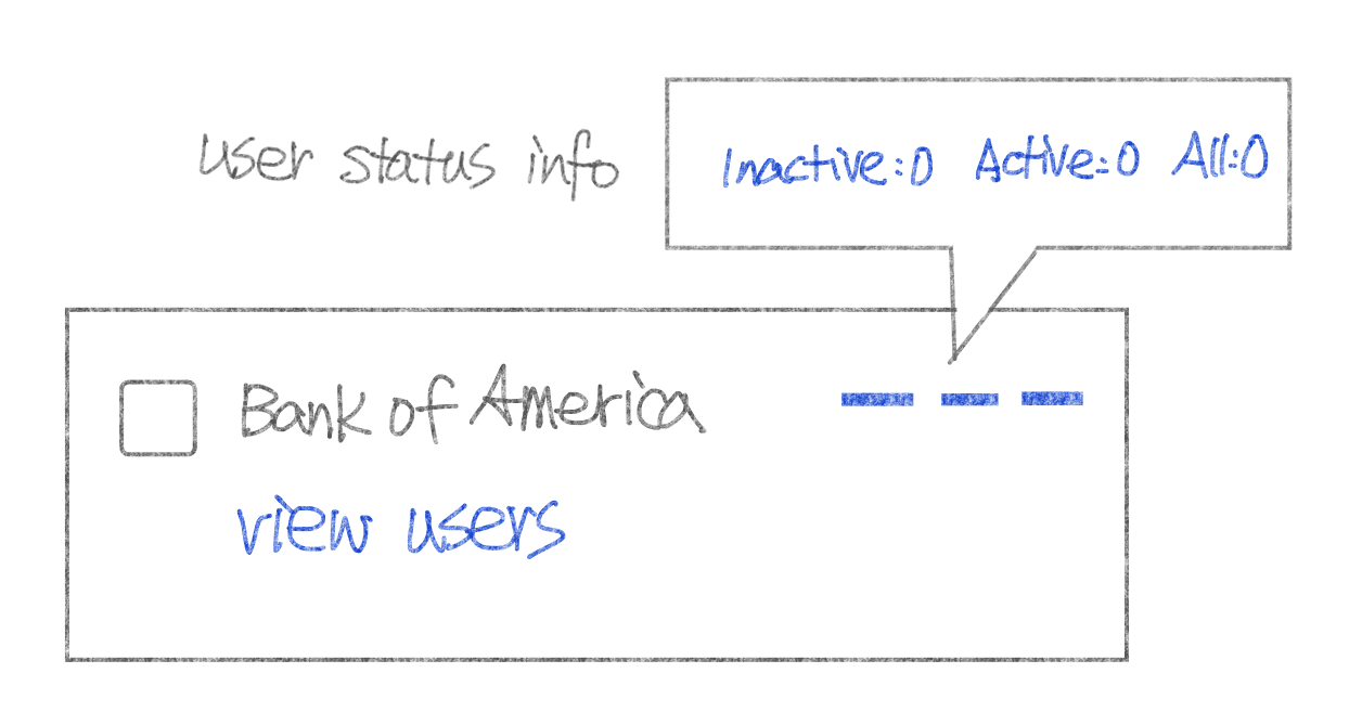
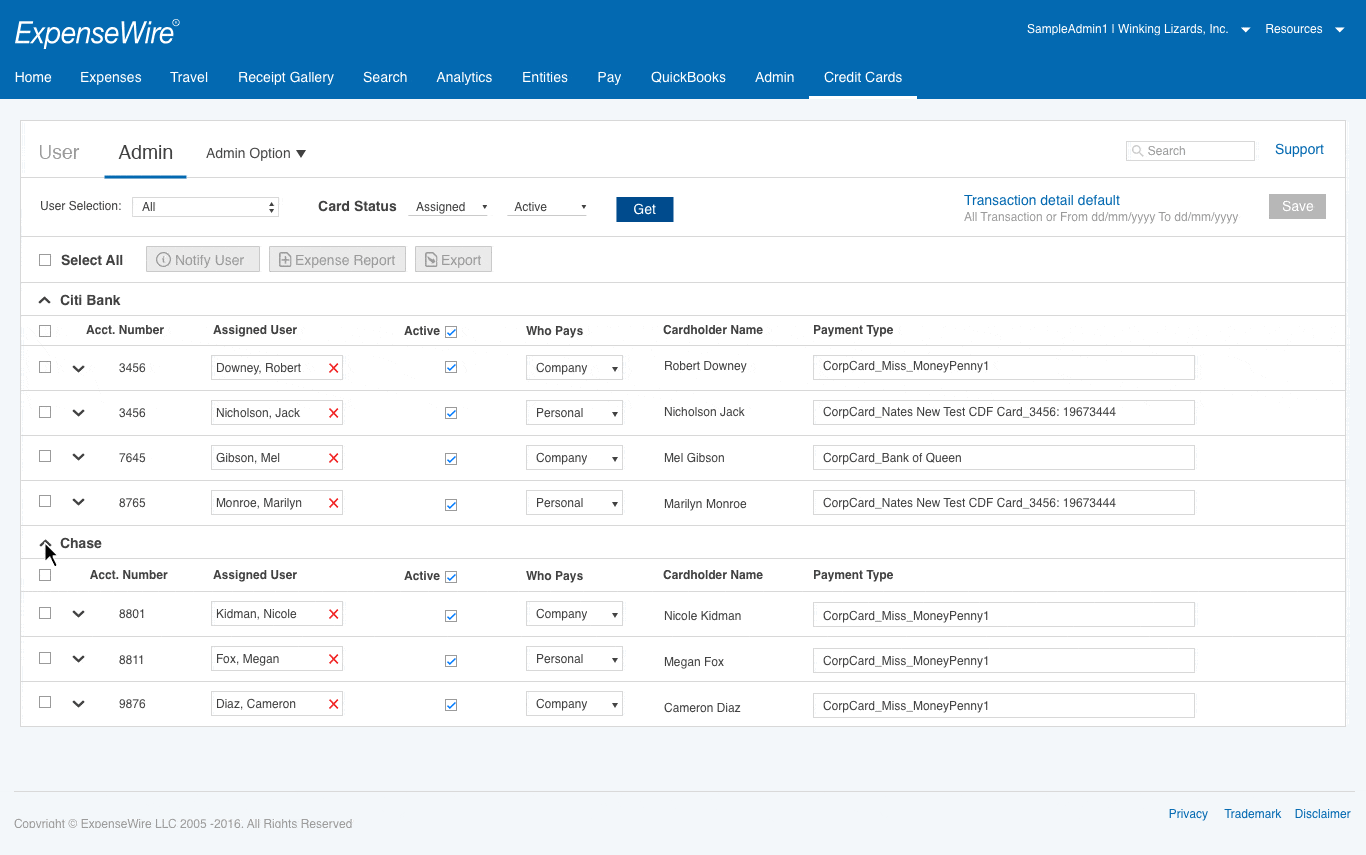
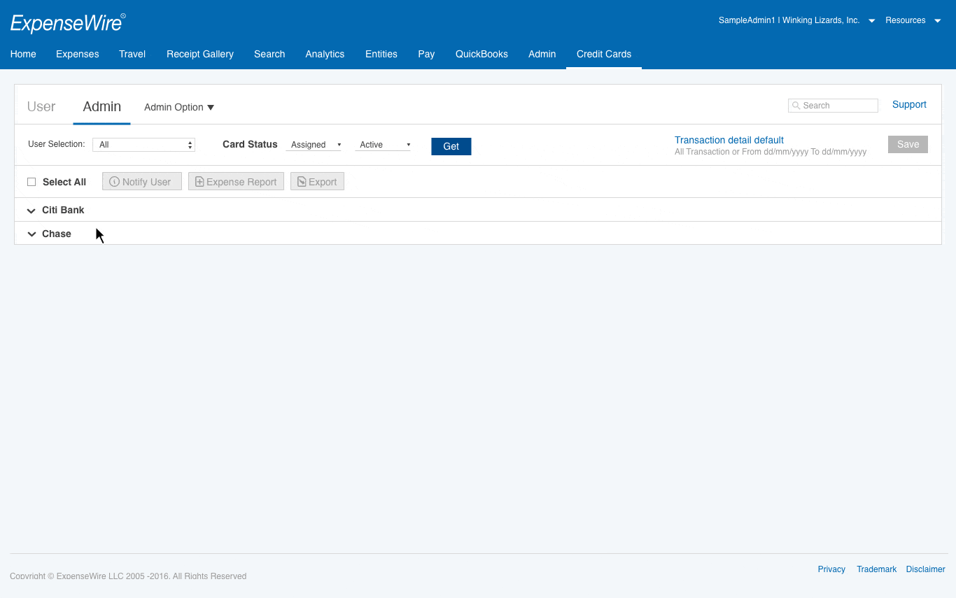
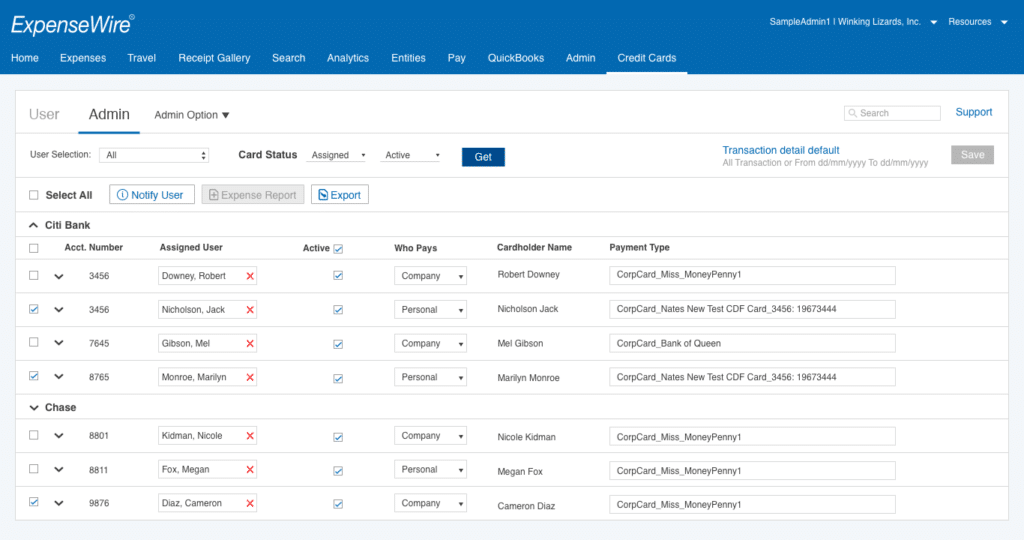
Admin component: bank-level 
(Bank name, check box, user status, view users)

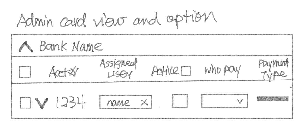
Admin component: card level 
(check box, assigned user, active status, who pay, arrow icon to open details)

User component: card level 
(User name, card info, arrow to open the detail section.)
Personal card (Ability for editing)
-Corporate card (No editing)

3. Defining component style: Admin and user

Define and design the transaction style

Designing the component style with the requirements.

Functionalities in the transaction statement

  • Transaction items: Ability to multi-select items/options for expense type/view expense report.
  • Filter items: un-Expensed / Expensed / Ignored / All.
  • Selected Item Actions: Ignore / Restore / Create the report / Export.

Statement filter functionalities
The filter function allows the user to search a particular transaction view.

The user filter criteria 
The filter items are by User, Card status, and Transaction with date and status.

The admin filter criteria
The filter items are by User, Card status with assigned and active.

4. Decision for filter style: Admin and User 

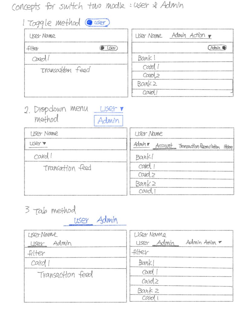
Dropdown v.s. radio button.

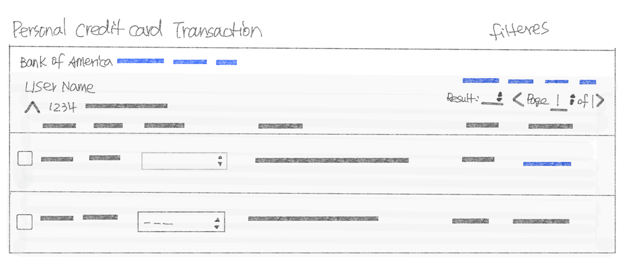
A rough sketch concept.


Most of the option styles in this application use the style of the “dropdown”. However, in certain filters, the radio button is a better choice in my opinion; for example, the date and the status within the user view scenario, allowing the user to change the search criteria accordingly. This is a crucial aspect and needs to be visible.

On the other hand, in the “admin” view scenario, I use the dropdown style, because the user doesn’t change filter criteria often and the functionality allows the user to save their filter setting. Therefore, there is no need to suggest another style.

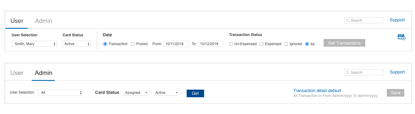
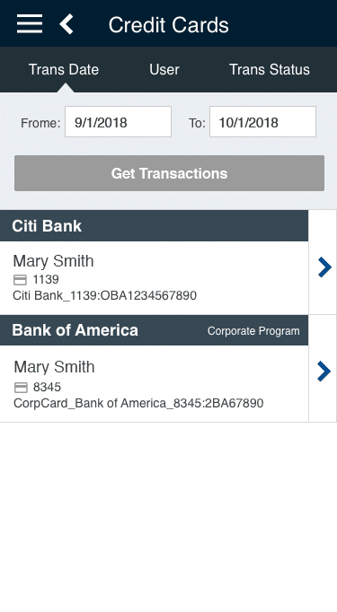
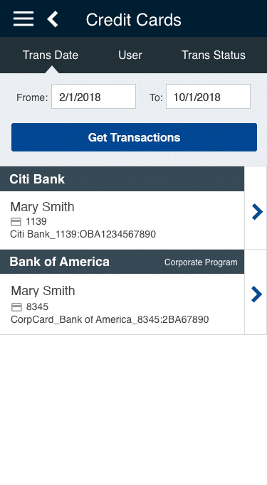
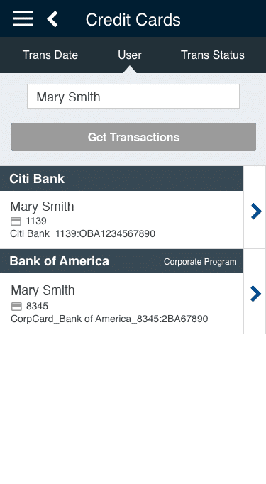
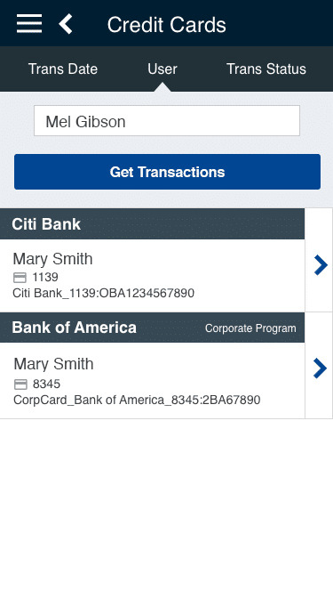
Transaction functionality
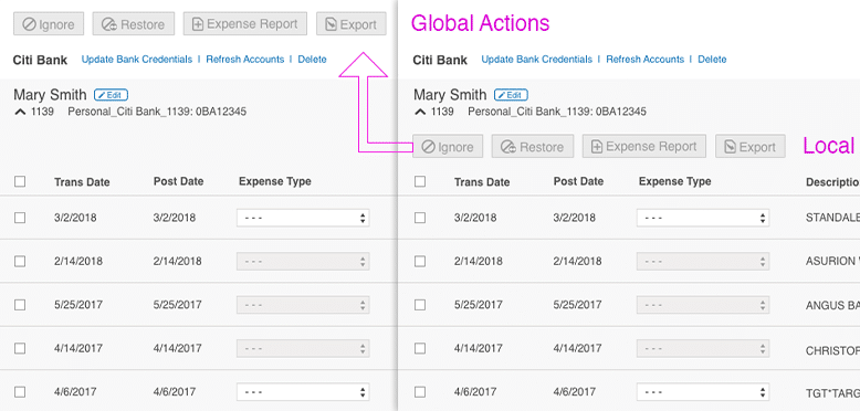
Local v.s. Global: My solution journey
Providing the ability to apply the action on the fly. My initial idea was to place these buttons in line with the transaction. Upon discovering the necessity for  a bulk action rather than an inline action, I needed to find a different solution.
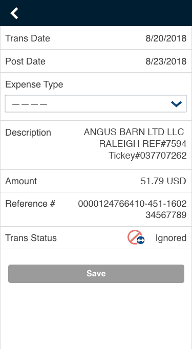
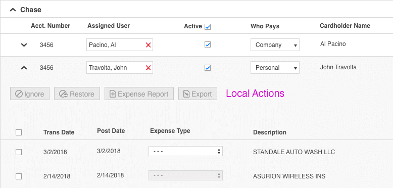
Local card level
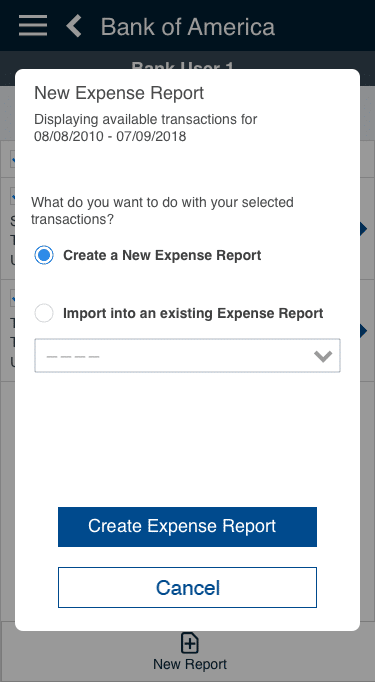
In order to fulfill both single and multiple select functions, my new solution is to elevate these buttons above the card level, so the user is able to apply a bulk action for their task.
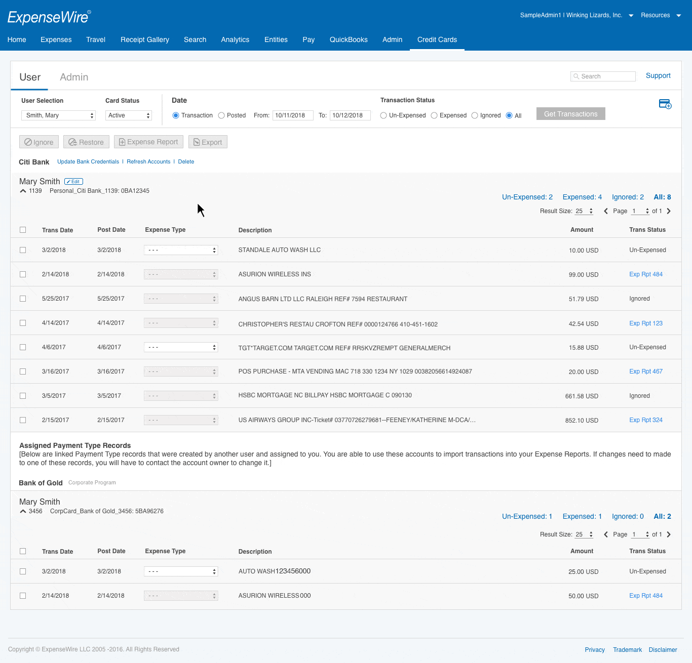
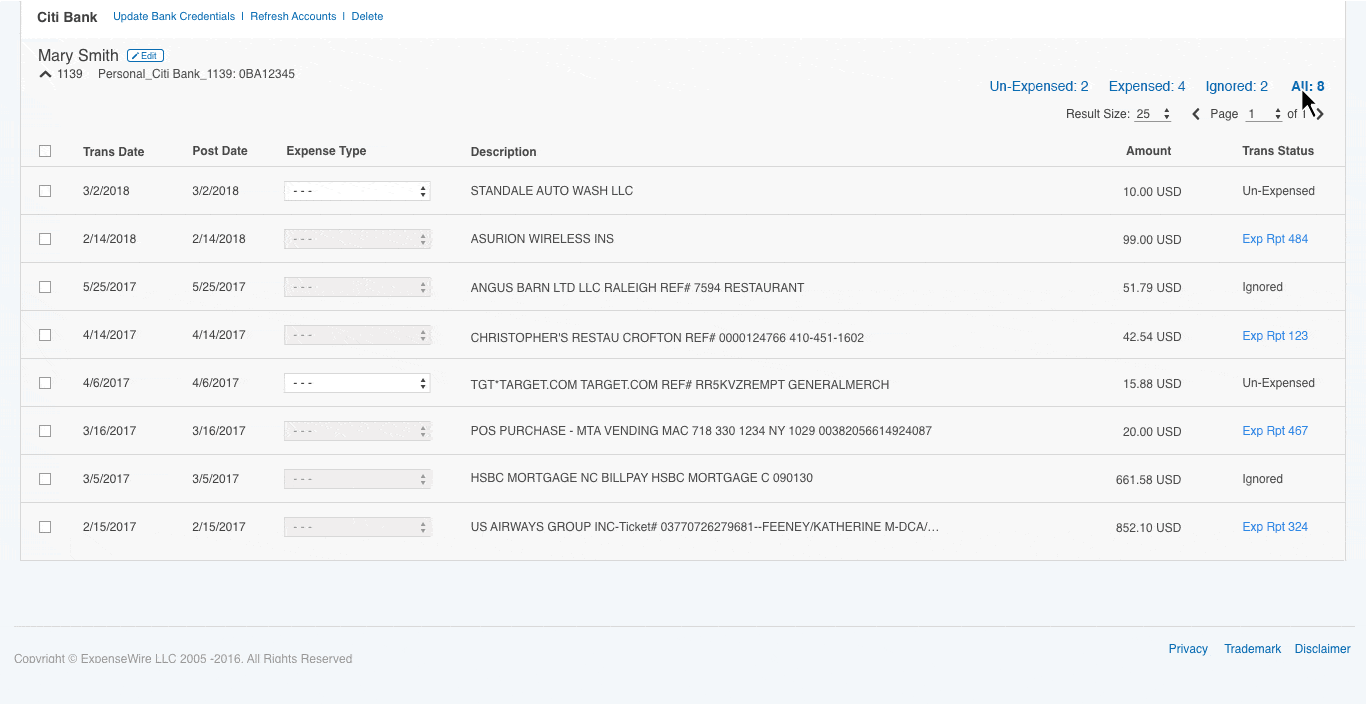
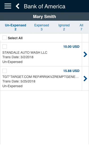
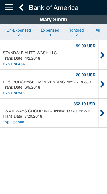
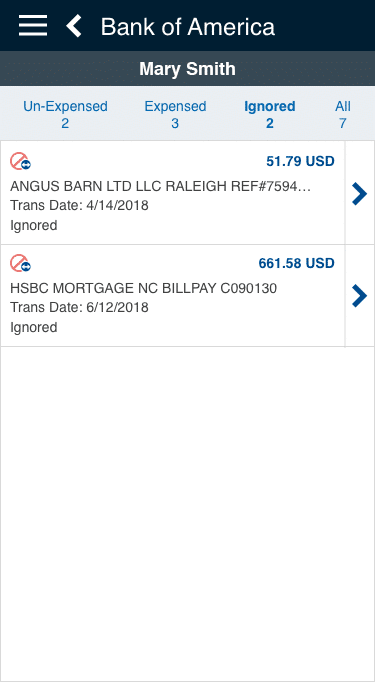
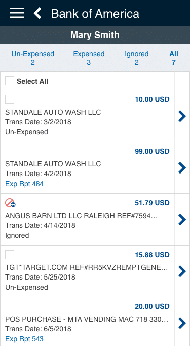
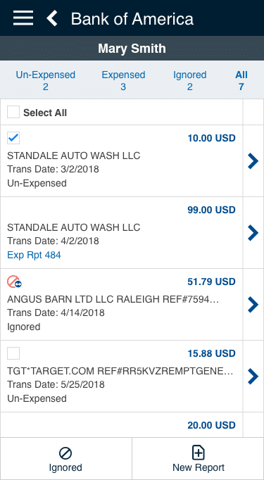
A Global Solution on the User side
Participating in team discussion, direction and final decision resulted in the transaction buttons being above the credit card which will allow applying the bulk action within single and multiple cards.

This is according to analyst data, that 75% to 80% of users  only have one credit card, be that personal or corporate, for their expenses.

Therefore, applying a global solution works well in this case. 

The Local Solution- The Admin side
On the other hand, Admin requires a less scrolling solution for the user. Scrolling and toggling among the users and their transactions on a long page are not intuitive to the user.

My solution to this scenario is to have its own independent action buttons within each card/user to fulfill the task requirement, instead of going to the very top. Therefore, the local card level solution works well in this case.

Different from the transaction purpose, admin has its own global multi-select function designed for managing multiple users. This allows the admin to manage multiple users at the same time.

Location for the User side transaction actions
Location for the Admin side transaction actions

5. Composing all elements together for the user to see when they land on the page.

Prototyping

The prototypes are followed by the product brand/style guidelines.

The User Interface and Features

  • Display transaction view by default. Toggle to open and close the transaction view.
  • Ability to filter the transaction criteria.
  • Card level – Ability to add, edit, and remove a personal credit card and bank information.
    • “Assigned Payment Type Records” info and “Corporate Program” label display for the corporate credit card, no editing feature.
  • Transaction level – Ability to filter the transaction view.
    • Allows the user to manage the transaction and to create a report. 
    • Allow a single or a multiple selection. 

The Admin Interface and Features

  • Admin grid hierarchy: Bank, card (user), transaction
  • Ability to save the filter setting.
  • Ability to notify users, create and export reports with single select as well as multiple select.
  • Ability to display multiple banks, their cards (users) and transaction.
  • Ability to assign a card and change the card status, as well as the ability to set the payment responsibility.
  • Ability to create reports from transactions.

Transaction filters

Filter features

  • Ability to see each status count.
  • Ability to change different status view.

The Transaction Buttons
There are four actions that allow the user to manage their transactions. Inactive by default, active when the item(s) are selected.

  • Ignore & Expense Report: Un-Expensed items.
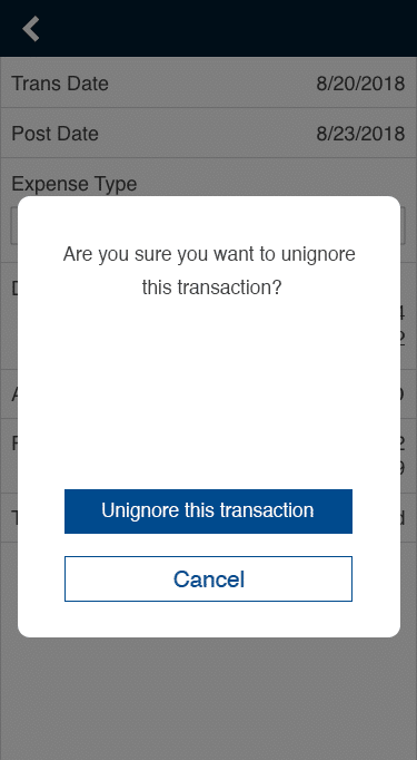
  • Restore: Ignore items
  • Export: All status.
More transaction examples
User: Edit Transaction Examples
  • Activate a different button with a different selection.
  • Pagination within card transactions.
Admin: Global Action Examples

Activate a different button with single or multiple selections.

Admin: Edit Transaction Examples

Activate a different button with a different selection and pagination within a card transaction

MOBILE VERSION

Allow the user to manage and create a report anywhere.
An autonomous framework from desktop, I was brought in  to support this mobile application to add a new feature called “Credit Card”. It has the same requirement as the desktop version, except no admin access in the mobile version. 

Mobile

Sketch the Concept

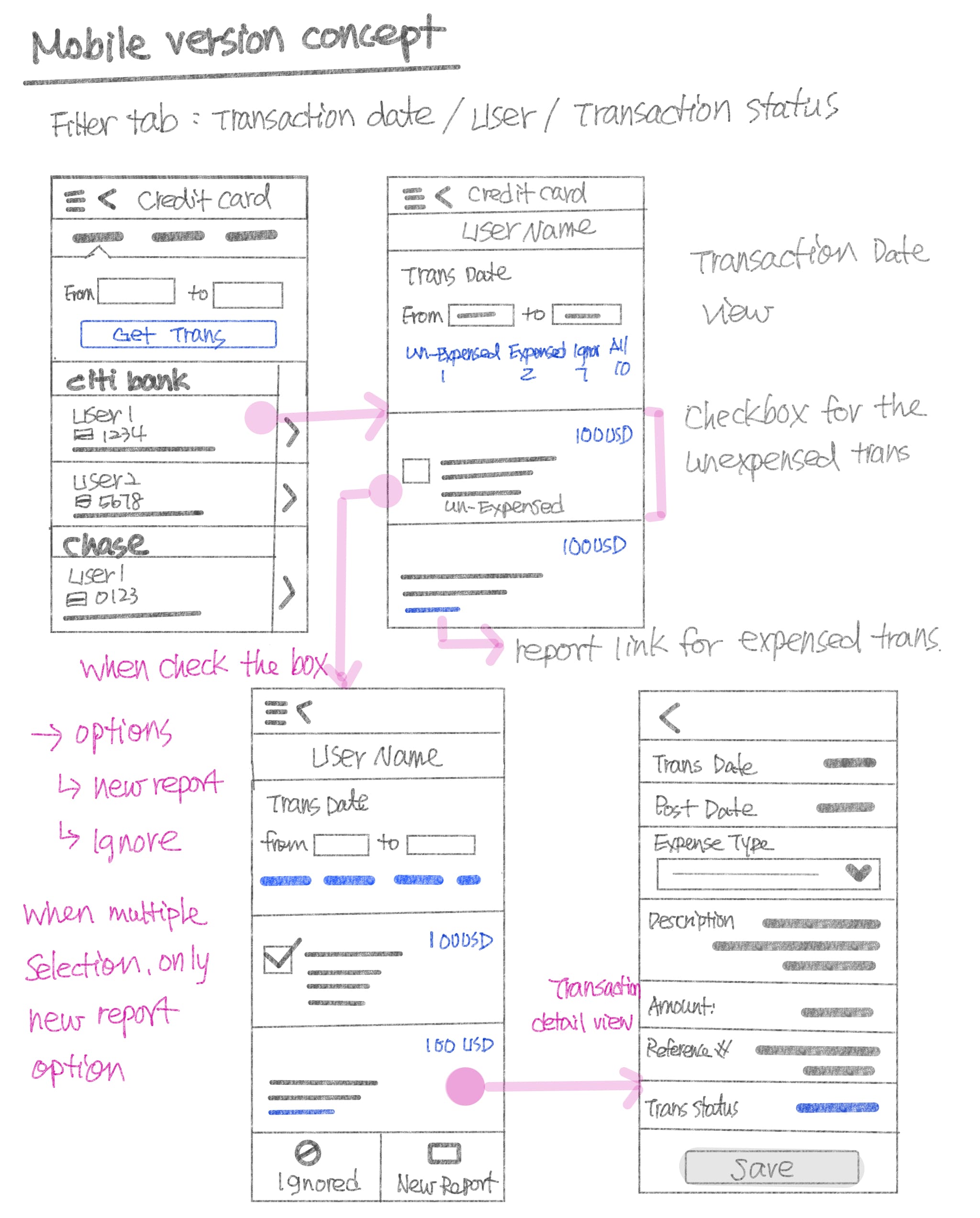
Design a solution within the current mobile framework.
Sketching out the user flow of the managing process. Mirror the desktop functionalities and create a user flow within a mobile environment. 

The screen information varies according to the user role when they sign in. If the user has a manager or admin role, they will be able to view their own as well as other users’ transactions.

The Admin and the manager role can search for different users.

The user who doesn’t have an advanced role, only views their own transaction.

Mobile Prototyping Examples

The User Interface and Features

  • Ability to display multiple cards, personal and corporate.
  • Ability to view the transaction by date, user, and status.
    • “Get Transactions” inactive by default, active when setting changes.

Transaction Date – default

Transaction Date – active

User – default

User – active

Transaction Status – default

Transaction Status – active

The Transaction Features

  • Multiple selection ability.
  • Ability to create a new report or add to the existing report.
  • Ability to view the transaction by Un-Expensed, Expensed, Ignored, and All.
  • Ability to un-ignore an item.

Transaction flow chart

Transaction Filter Examples

Filter with “Un-Expensed”

Filter with “Expensed”

Filter with “Ignored”

Default display all

Transaction Actions Examples  

Select the un-expensed item(s)
Two options after selected

Action options – Create a new report
or add to an existing report

Action – Un-ignore
Clicks the ignored icon

Un-ignore confirmation

Save the new status 

Project Learnings

I have an opportunity to participate in a user study within this project, sitting in many sessions to study and observe how users navigate the interface with assigned goals and tasks. Interestingly, I observed during study sessions, a total of ten users, ranging from a computer-savvy business owner, to individual utilizing an old fashion reporting style. Most people who initially struggle with the application, found themselves with a clearer understanding afterward.

Through the UI/UX, we (the team) are confident in helping the user. However, after the initial attempt at studying this product, I have come to realized the importance of having thorough research before refining the interface, which will reduce the learning curve for users from multiple generations.