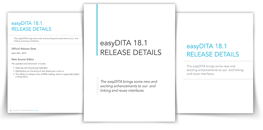
is a DITA standards-based Component Content Management System (CCMS) that turns user content into flexible, actionable, and manageable data. It provides product life-cycle, user and service management documentation
Platform: Web-based only
Company: Jorsek Inc.
Overview
Project Brief
Enhance the interface within the current framework, in order to bring the application UI style up to date. My focus pertains to the UI enhancement of the product, as well as the user flow, providing a friendly user interface and improved user experience.
Project Scope
“easyDITA” is a complex Component Content Management System. My project scope covers a few features of this application. They are as follows (click to see design process):
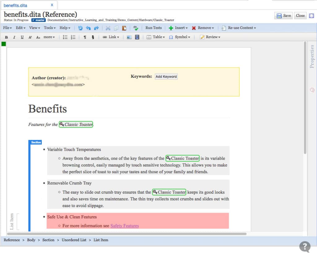
The Topic Editor is where users edit content in a structured authoring environment. When users Create & Edit a new topic in the Content Manager, this is the screen from which the user creates their content.
The Problem
The problem with this interface is the visual presence, element format and it’s hierarchy.
The interface is not intuitive, as it relates to the prolog update and editing.
Overemphasized title typography and boldness highlight for each section can be (often is) visually overwhelming to the writer.
Element nesting and related formatting issues results in content distorting in the deeper levels.
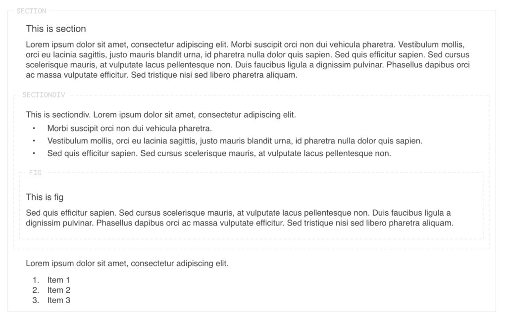
Example of the old topic elements
The Challenge
In order to have a visually appealing and clear label for each element and its subsequent level as it relates to viewing and editing. I found it necessary to familiarize myself with the Dita “glossary entry topics”, understanding building elements to help design a particular formate style.
Tools
Sketch InVision CSS / HTML Github
My Mission
Designing a clean and well-formatted element through the visual structure, and providing a clear visual indication for the user as they edit content.
Solving the content block format issue caused by subsequent nesting elements.
The Team
I work with a cross-functional team. As the primary UI/UX designer, I’ve been involved in this project from the analysis of structure, sketching element concepts, utilizing CSS to style the interface, and delivering a final design for a live application.
The Process
Analysis
The existing functionality of the credit card information is located in the Admin section and under each person’s account, with the function that allows the admin to edit card information only.
In order to meet the new feature’s criteria, it will require a new tab and two views, the user mode, and the admin mode (desktop only).
The mobile version of this new feature is the same as the desktop except without the admin feature, due to most people do their admin tasks on the desktop.
Sketch the Concept
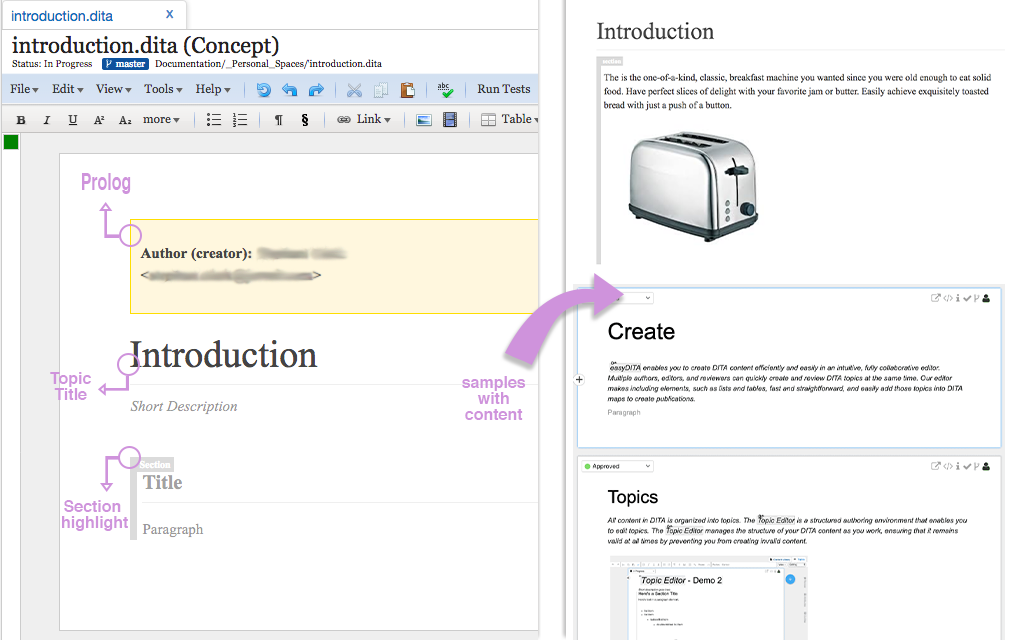
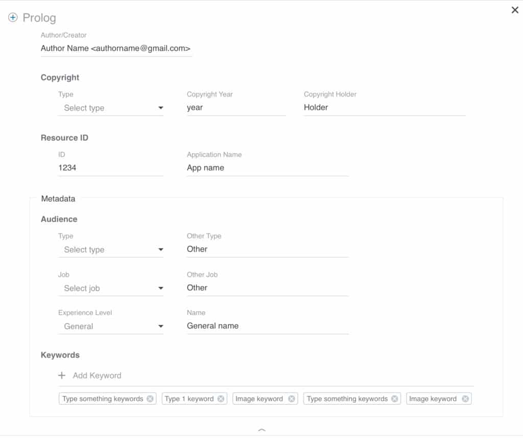
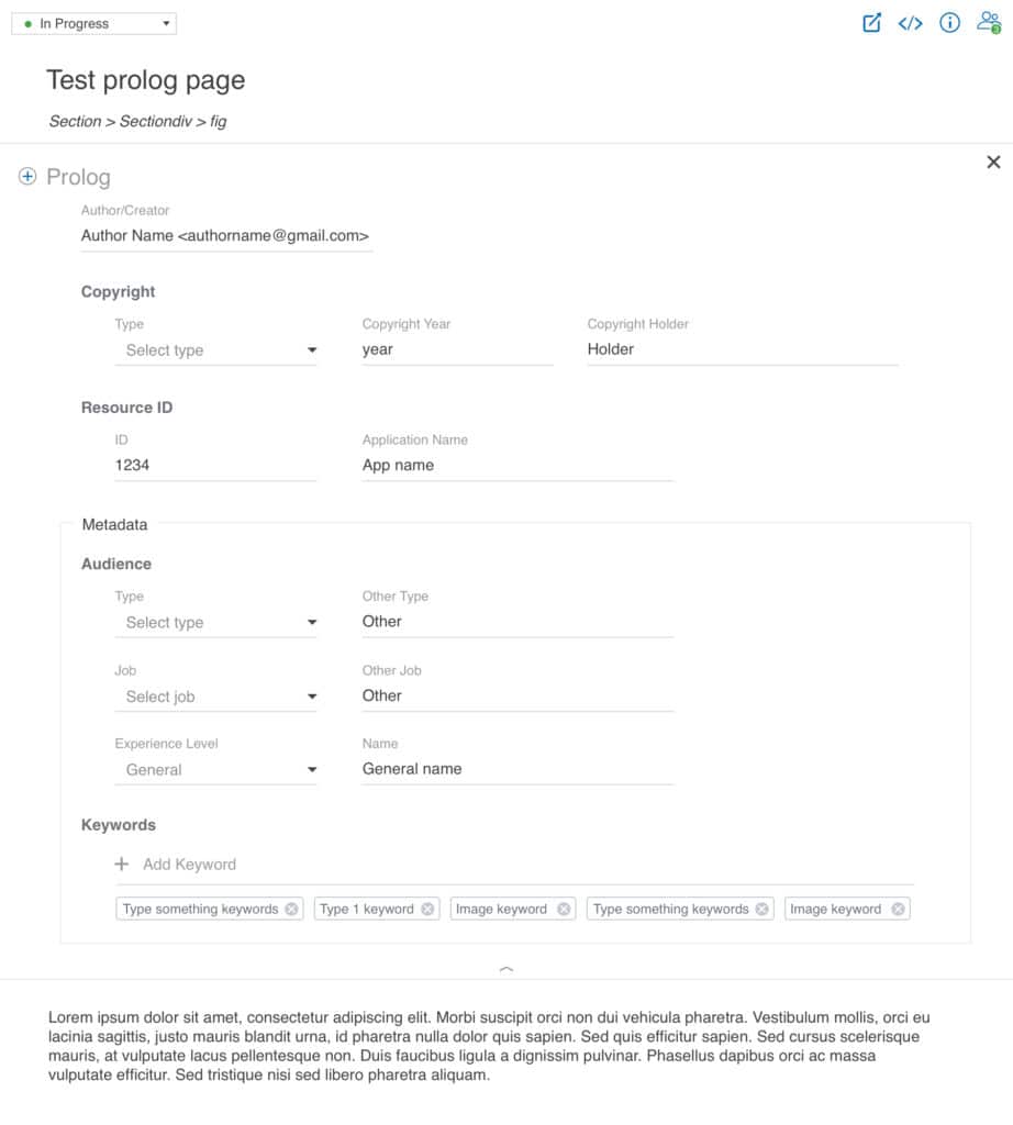
Embed an intuitive and fully functional “Prolog” element within the “Topic” page, allowing the user to update and view the data.
Creating an information hierarchy layout design within the “Topic” edit space, by creating a clear visual flow and label for each element. Whether the element is stand-alone, nested, or in the edit mode.
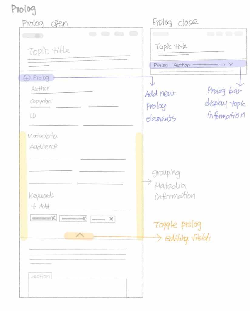
Prolog fully open and close
Ideas for element structure and style
Prototyping
Prolog Section
Creating an editable prolog section within the “topic”. The user can add more elements to the document accordingly.
The “metadata” section of the prolog contains information about a topic and The “keywords” element contains a list of keywords that can be used by search engines. Therefore, having ability to add and remove keywords is an essential function for users, enables them to target their audience.
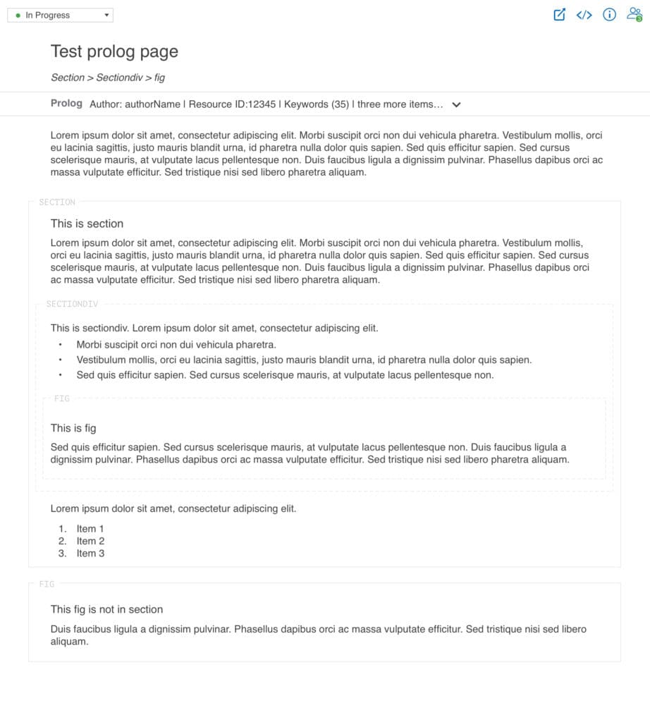
Opening and closing the prolog section uses a toggle function.
Click on the prolog bar to open the section.
Click on the X icon or arrow icon to close the section.
Prolog section open
Prolog section close
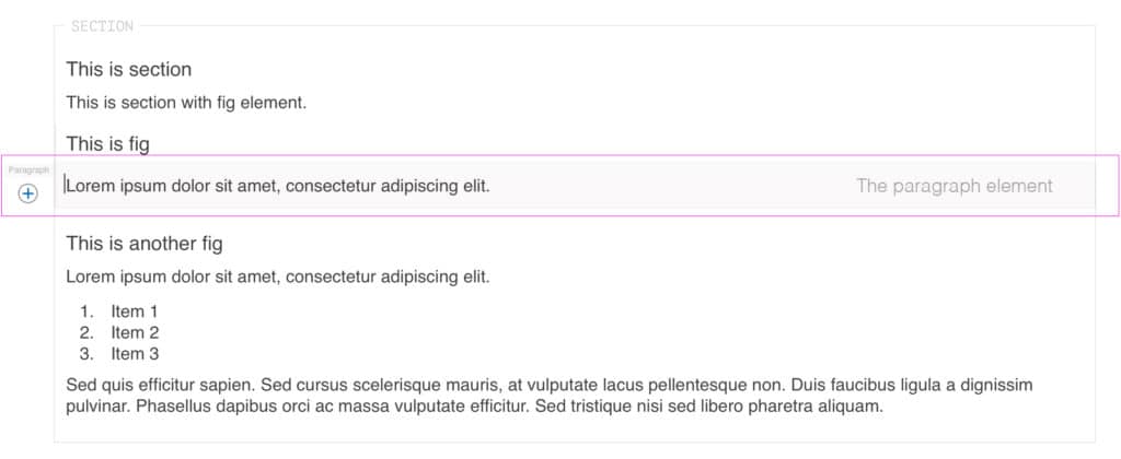
Topic element style
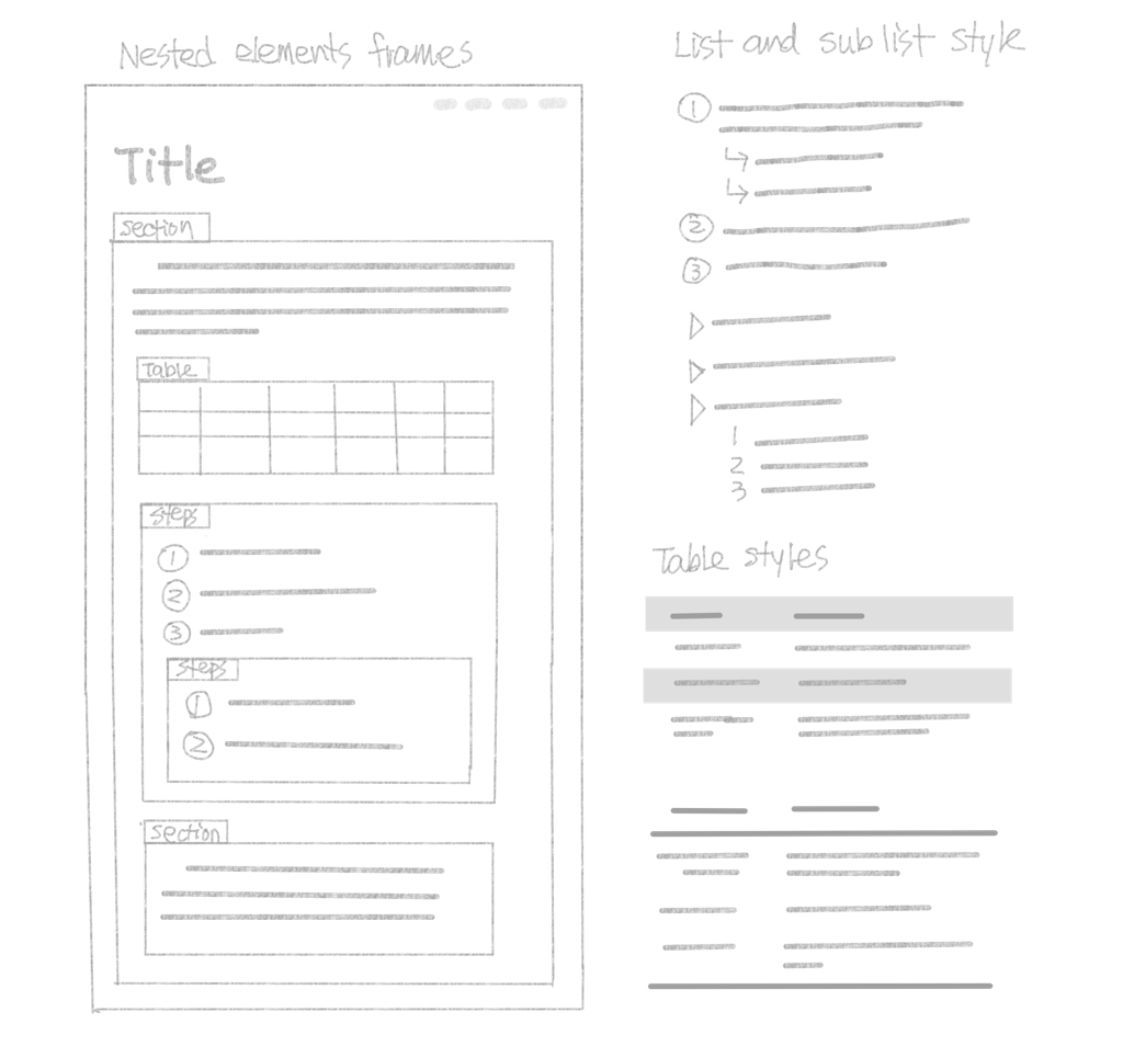
Creating a clean and balanced label style for each element.
Having a secondary label style when the element is nested.
Display the plus icon when the element is in edit mode.
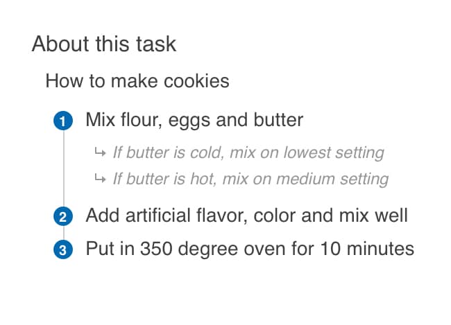
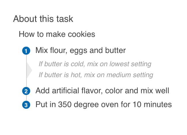
Alternative element style when nesting.
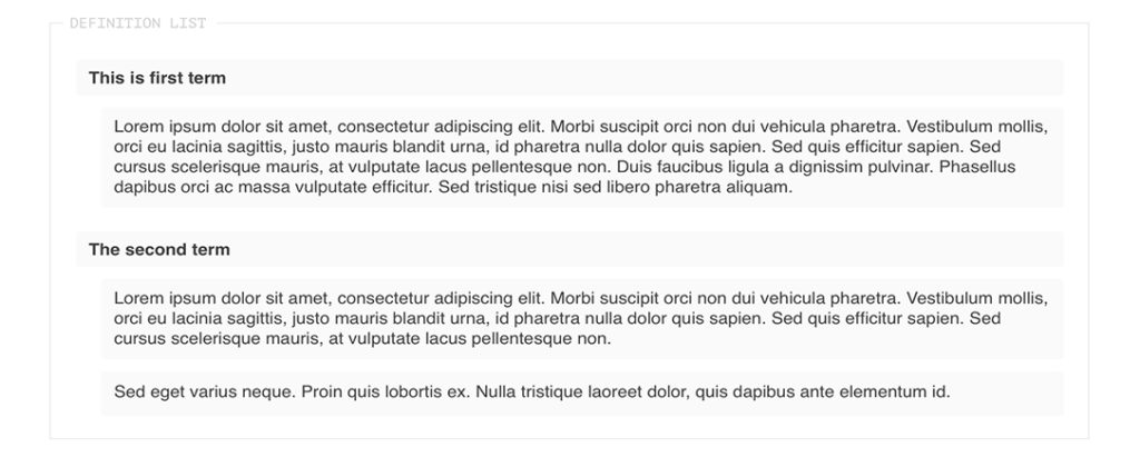
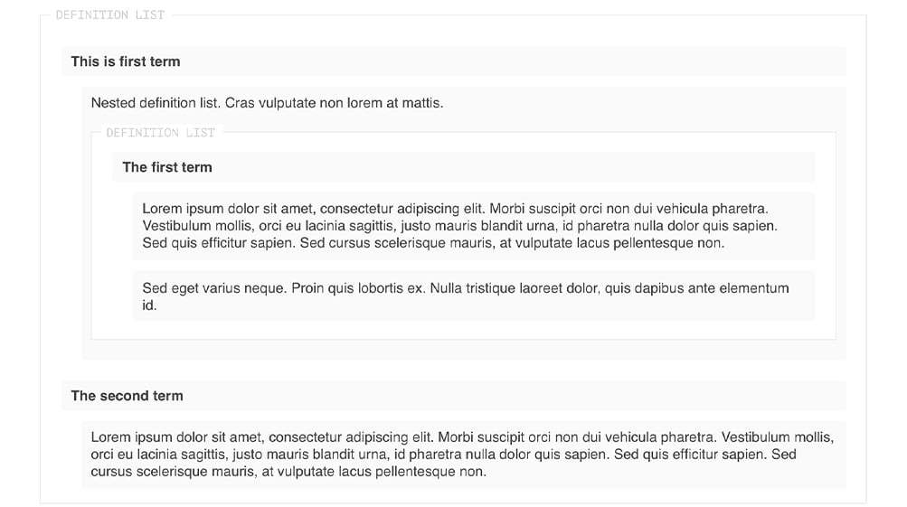
Definition list style
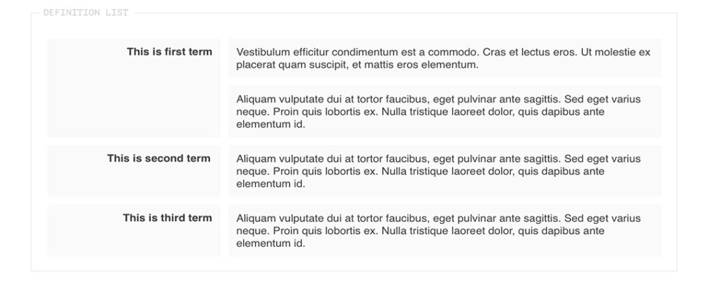
Definition list nested styles
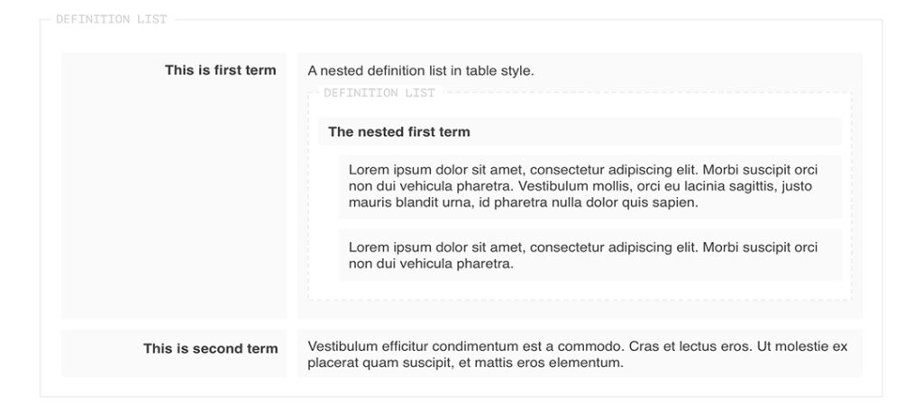
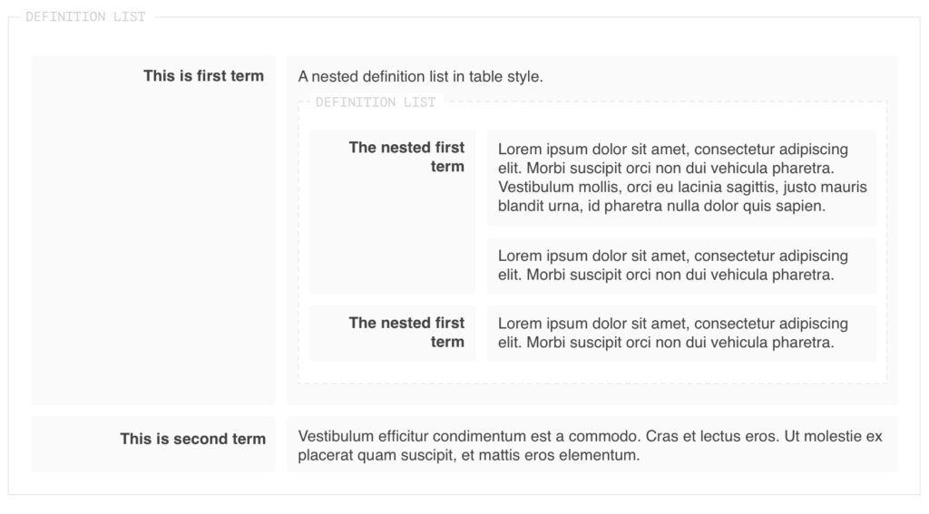
Definition list nested style
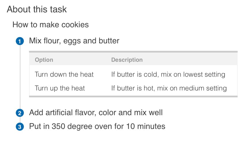
Steps with choice nested styles
Other elements nested styles
Project Learnings
The completion of this project has given me a deep appreciation for a sound design, resulting from a good software interface. Once I solved this UI element style issue, as well as its complicated content scenarios, I found the visual hierarchy of each element really helped the user to compose their work more efficiently. The delicate balance between the “Greater” and “Lesser” aspects of the visual style will make the difference in the final presentation and overall user experience.
As a result of my involvement with this project, I had a new CSS experience with Github, as well as other applications, which brought my CSS skill to a new level.
The system screen view
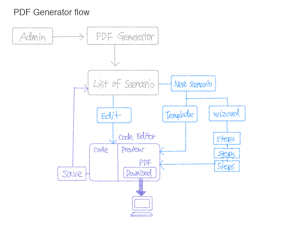
Project 2: PDF Generator and Templates
The PDF generator allows Administrators to create customizable PDF transformation scenarios directly in easyDITA.
The Problem
The accessibility issue. Finding the PDF generator as an essential feature must be addressed because the current location is buried in a hierarchy from the user.
The visual hierarchy issue. The “code editor” and the “preview panel” interface are not well defined.
The default template is generic and inadequate for use as the main product PDF theme. A design and style for its output were required.
The Challenge
Page layout style for PDF: Design application v.s. CSS
The PDF generator includes a DITA to HTML processor, as well as a PDF publishing engine that uses the “Prince XML” product, allowing the use of CSS to style the PDF output.
Thus, in learning their guideline and selectors for CSS is a vital task in editing a pdf style. Applying certain graphic design elements and scenarios can be frustrating at times because of the environment. Instead of using “Indesign” to create the page layout, I use CSS to style the pages.
Original screens
Tools
Sketch InVision CSS / HTML
My Mission
Separating this feature from other plugins, and Bring it to the top of the hierarchy.
Design a simple streamlined generator process for the user to create their custom pdf.
Create multiple PDF template styles for the user to apply
The Team
I have enjoy working within a cross-functional team. As the primary UI/UX designer, I’ve been involved with analysis of the feature and its user experiences. I sketched solution concepts, prototypes and delivered a final design of the PDF templates.
The Process
Analysis
What is the flow and what will the user need? This feature is only accesiable for admin users.
The PDF generator includes a built-in code editor and preview panel that needs to be embedded into the flow.
There was a need to emphasize the visual hierarchy for the code editor interface.
Design page layout styles for default color and black and white PDFs.
Sketch the Concept
The PDF generator includes a DITA to HTML processor and a PDF publishing engine that uses CSS to style the PDF output. Thus, this feature needs to include the following:
Ability to create a new scenario and fully customize the PDF format.
The PDF generator includes a built-in code editor and preview panel that needs to be embedded into the flow.
The PDF publishing engine allows users to preview and download a PDF from the preview panel.
Ability to change the code location as well as the map.
Prototyping
If a user can configure their “pdf” through a wizard, which can guide them through the setup process. I proposed that the user be able to create a new scenario from the wizard or template layout.
The wizard will guide the user through the format set up.
The template defines the “DITA Open Toolkit” version, plugins, and parameters to be used when publishing. However, this allows the user to create or modify their own publishing scenarios.
Concept 1 The wizard functionality
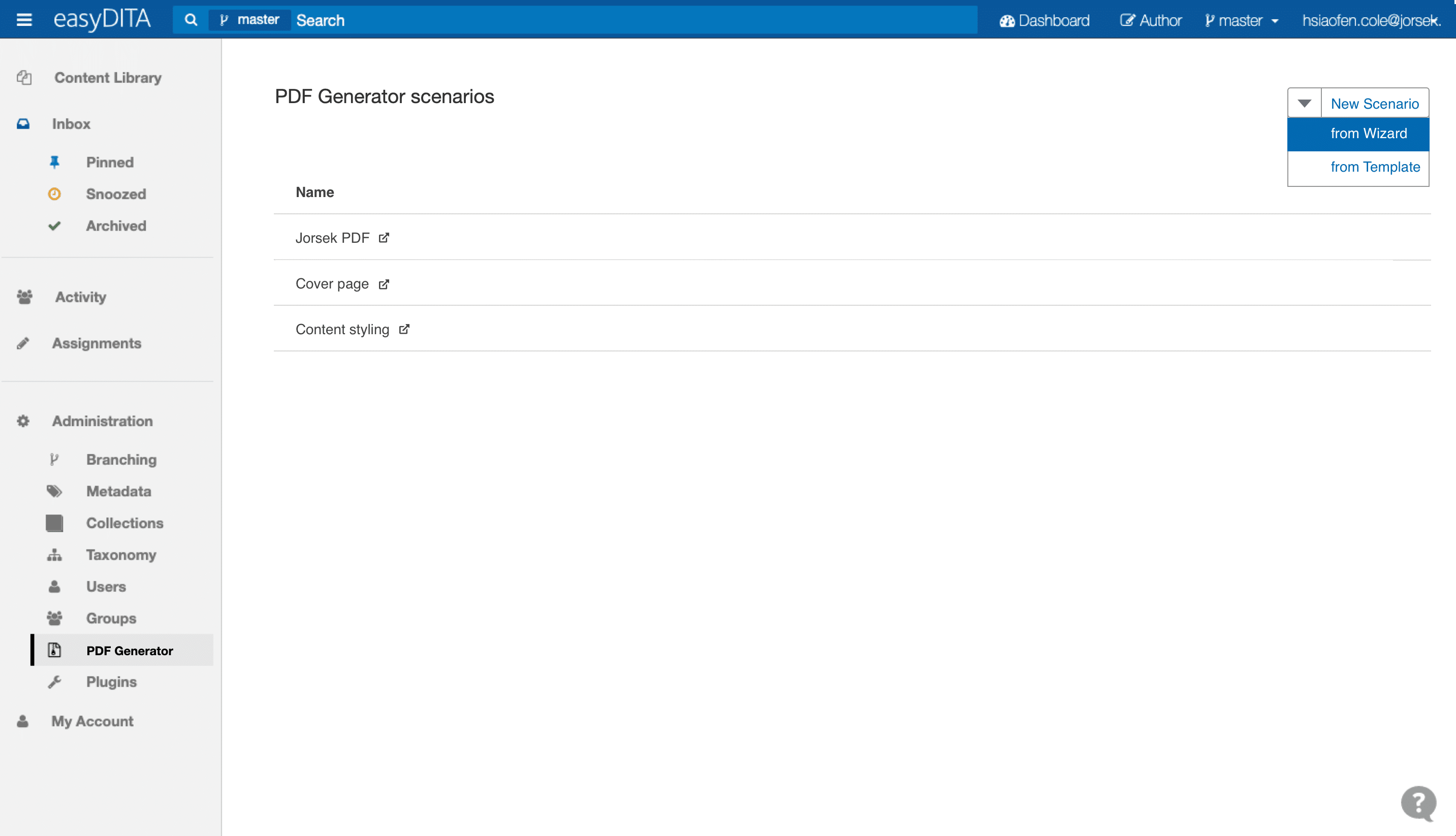
Migrating the “PDF Generator” and placing it into the Administration list.
The default screen displays all available scenarios
The “New Scenario” dropdown included two options; create “from Wizard” or “from Template”
Ability to edit the existing scenarios
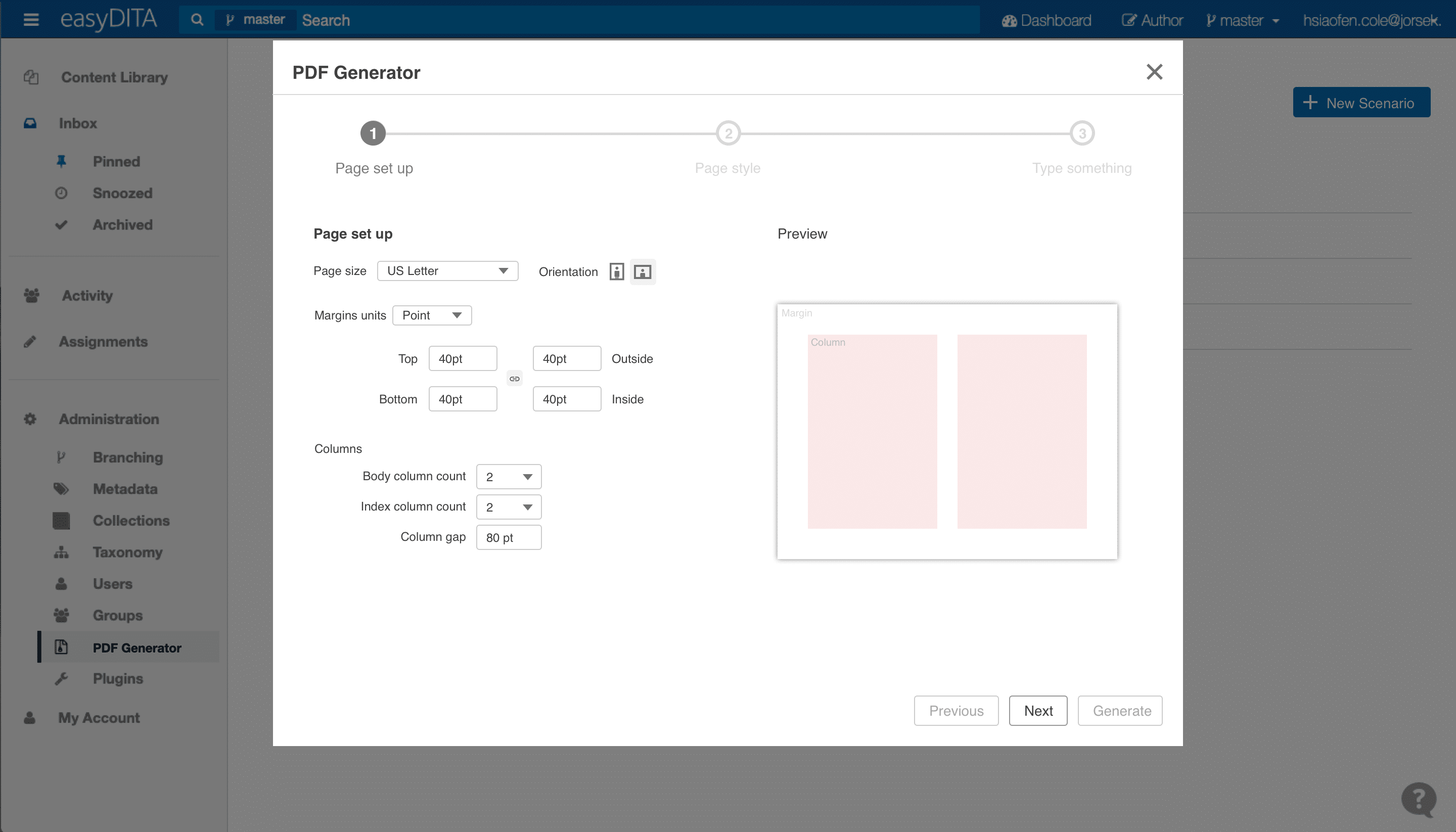
Wizard page set up – The default window.
The user is able to set up the following:
Page size
Orientation
Margins, with unit options
Columns and column gap
The initial configuration has three steps, more settings can be embedded depending on demand.
This is problematic, however, because of the technical and support issues, and became a none viable option going forward.
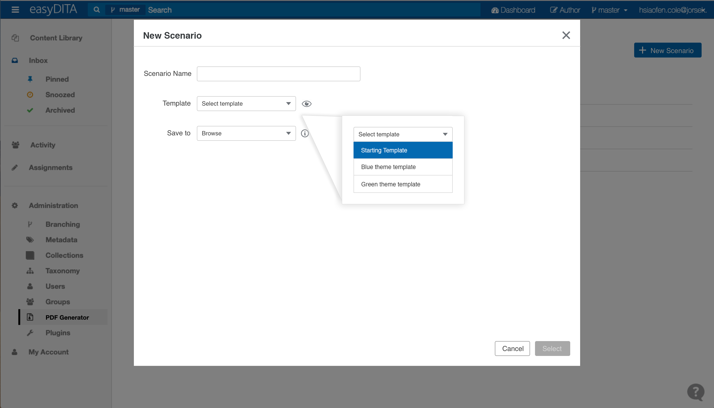
Concept 2 The template
Migrating the “PDF Generator” and placing it into the Administration list. When clicked, the “New Scenario” button opens a New Scenario Window, which allows the user to:
Enter a scenario name.
Select “Starting Template” to create a new scenario from the template.
Ability to preview the template and toggle on and off.
Ability to save this configuration file to a desired location.
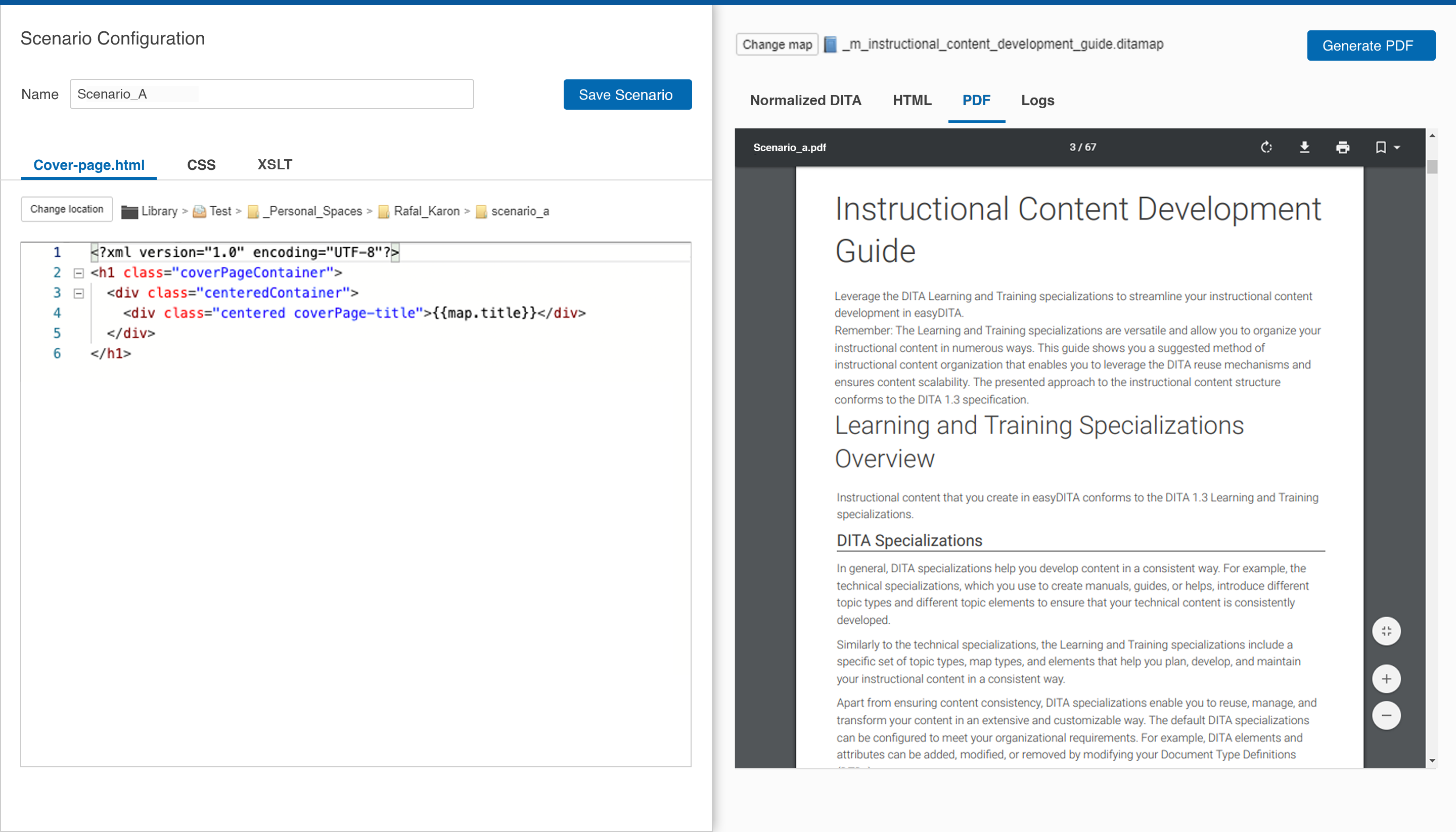
Code Editor Window Focus on visual hierarchy and content flow. Providing a clean appearance with a side by side panel view for editing and preview.
Save Scenario button: The new publishing scenario is now available in the publishing interface.
Left panel – Code Editor The user can customize the PDF output styling by editing the HTML and CSS code.
Ability to view multiple codes by clicking on the code tag.
Ability to save this configuration file to a desired location.
Right panel – Preview The user is able to preview the PDF output styling.
Allows to change to a different ditamap prior to publishing.
Ability to preview other information on publishing.
Code Editor Window
Project Learnings
Fully customize PDF output styling with CSS is a powerful feature, which can turn a lengthy and plain topic or content map into a well designed and formatted document. Applying CSS within the live edit environment not only allowed me to experience the new styling method but also enhanced and polish my CSS skill.
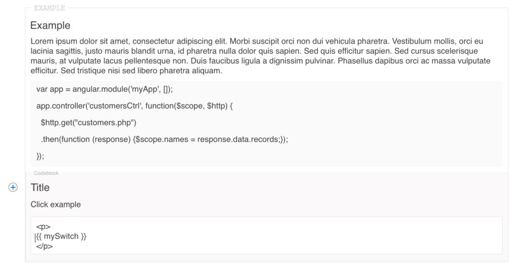
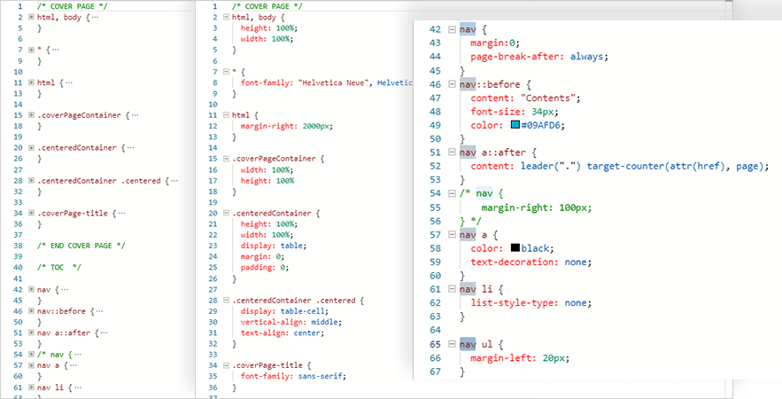
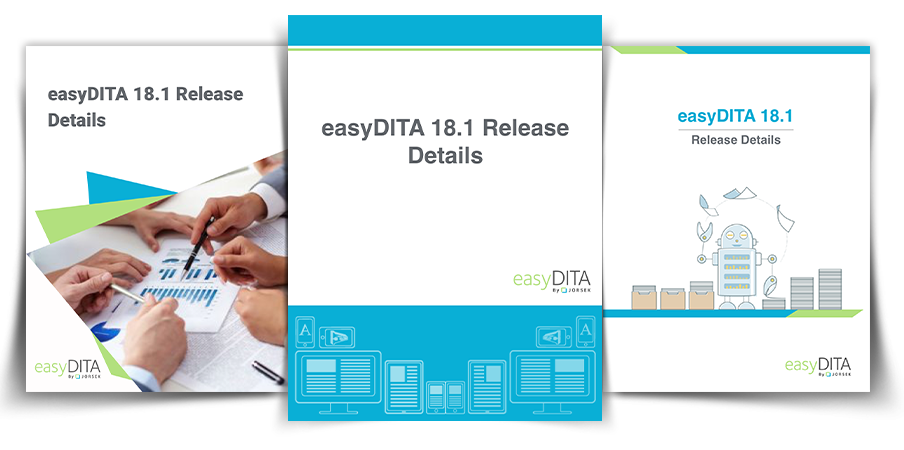
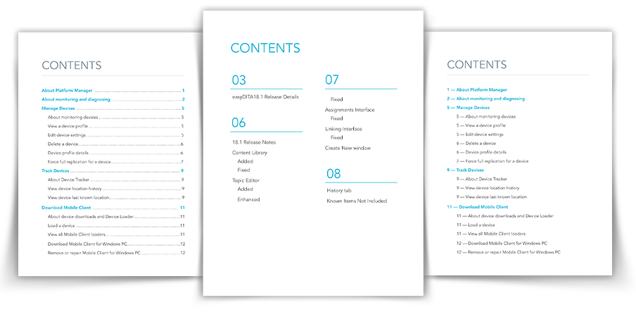
The following are some examples of PDF styling with CSS.
PDF Cover styles
Content styles
Title page styles
Table styles
Page header and footer style
Page header and footer style
Project 3: The Publishing
Publishing is the process of transforming DITA content into output formats such as PDF and HTML. Publish your content to convert it from DITA content into a format that you can deliver to your users.
The Problem
Inconsistent visual style.
Visual hierarchy and flow are not well defined.
Visual confusion between informational texts and functional links.
Too many “clicks” to publish a document.
The Challenge
Restyling and representing the visual unity, from their original style and elements into their reimagined form, maintaining a visual continuity within the application.
A concise user flow with a clear visual hierarchy is a must for this modular style.
Original screens
Tools
Sketch Illustrator InVision
My Mission
Unifying and redefining the UI style within the visual hierarchy to streamline the publishing process.
The Team
I have enjoy working within a cross-functional team. As the primary UI/UX designer, I’ve been involved in this project from analysis of user issues, sketching solution concepts, and delivering a final design.
The Process
Analysis
All “Publish” buttons lead to this pop-up module, connecting to the “Output” tab within the “Author” navigation header, allowing users to view and filter their documents. Thus, the main focus here is to generate an output document stored within the “Output” section.
My focus is to design an engaging and clear options interface for the user, allowing maximization of this modular engine. In tackling this mission, I review and examine each screen carefully in order to understand the needs of the user. The process of examining raises a few questions:
Is this publishing configuration clear to relevant users?
Deciding on the necessary work flow, and what can be consolidated?
What is optimal for organizing new document information and functions?
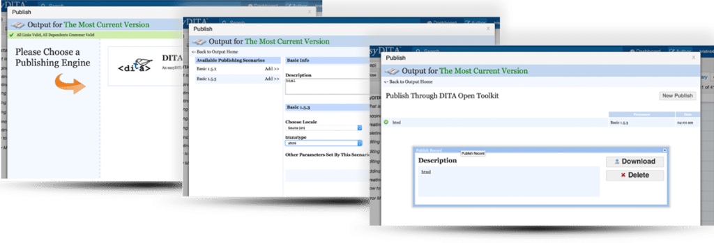
The old Publish user flow
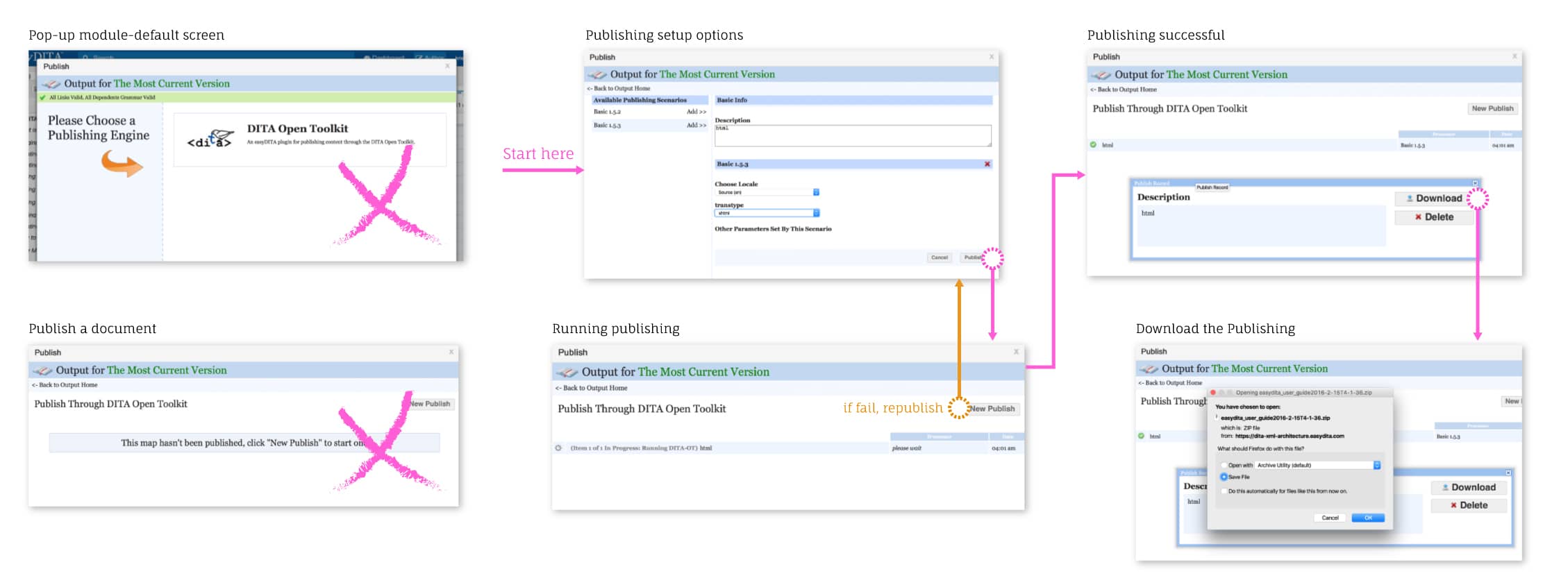
Solutions:
The removal of unnecessary steps, ensure an efficient publishing process for the user.
Restyling the modular interface, thereby emphasizing the visual hierarchy in a clear format.
Design and organizing of the detail screen and its related information.
Removing non-necessary screens
Sketch the Concept
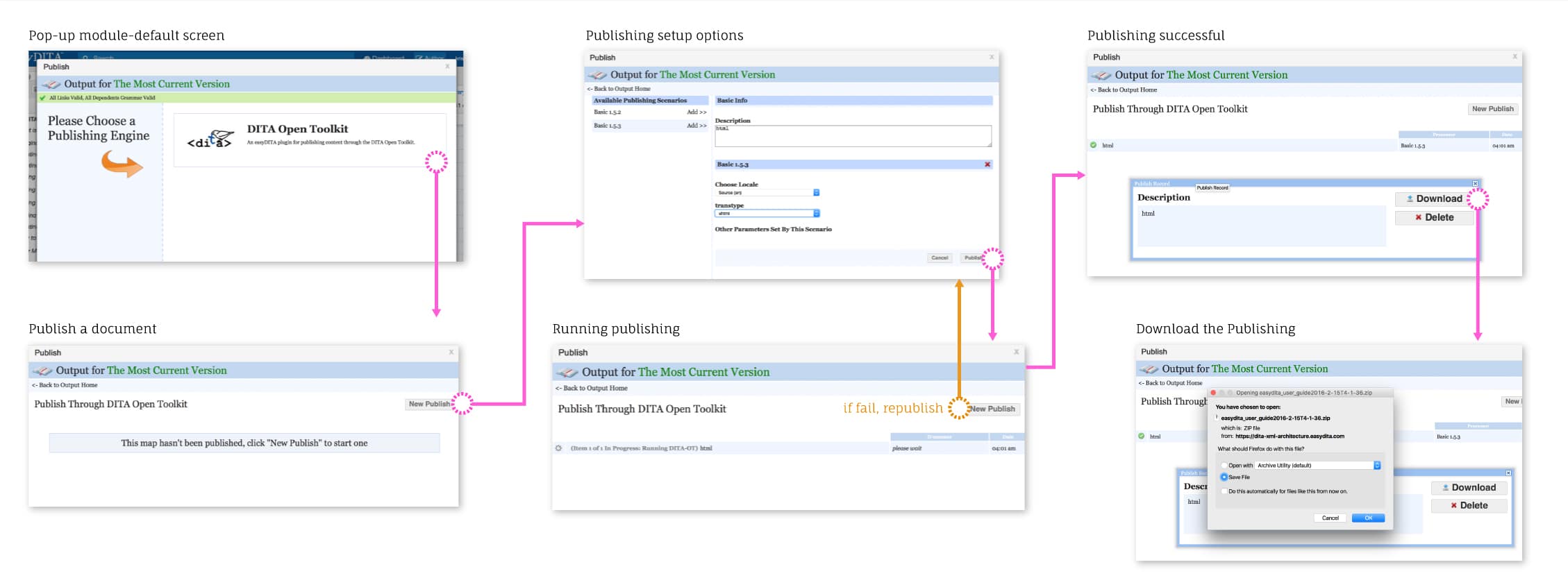
After carefully examining and understanding the publishing flow, it’s time to map out the new concept. Here we add additional functionality to the publishing flow, allowing for an enhanced user experience.
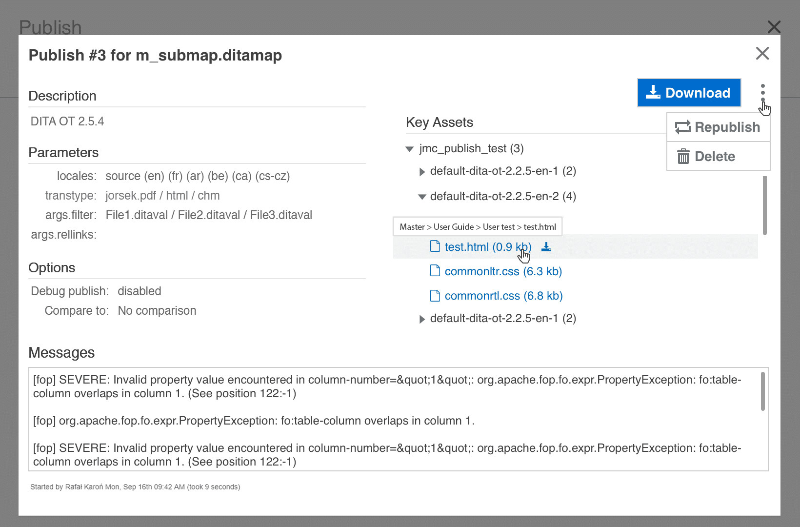
Featuring thePublish Recordwindow: – Display information and details about the document. – Enabling the ability to download the output document as well as its individual key assets. – Ability to republish or delete the document. – Additionally, a new link is applied to the output status window, enabling a connection to the “Output” navigation tab.
Initial user flow concept
Prototyping
Conceptualizing and developing concepts into visual form. Designing the future Publish module and its relevant visual aspects.
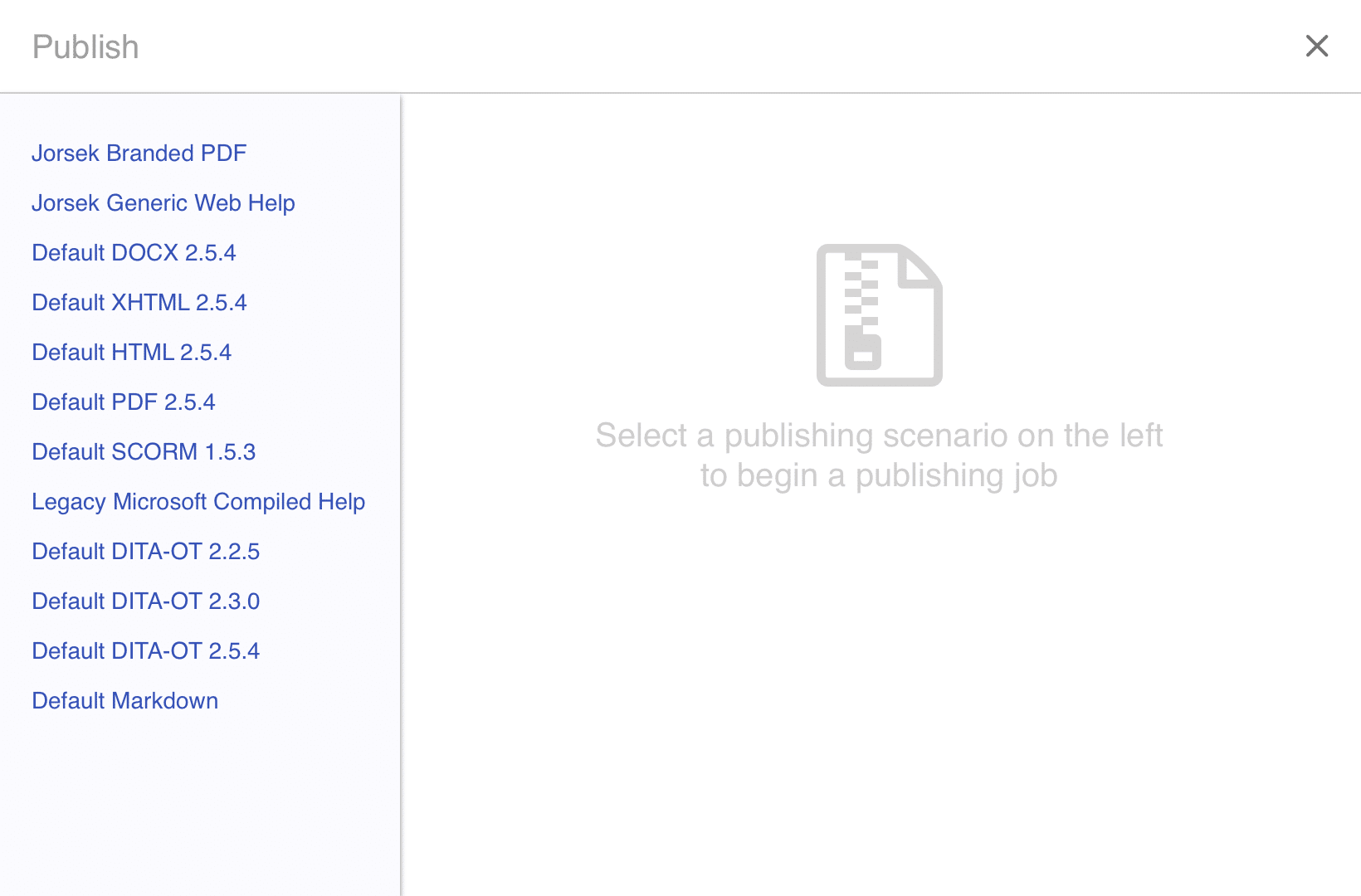
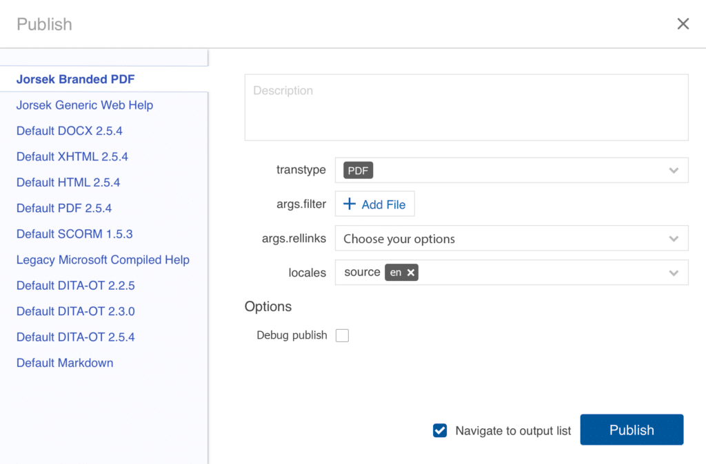
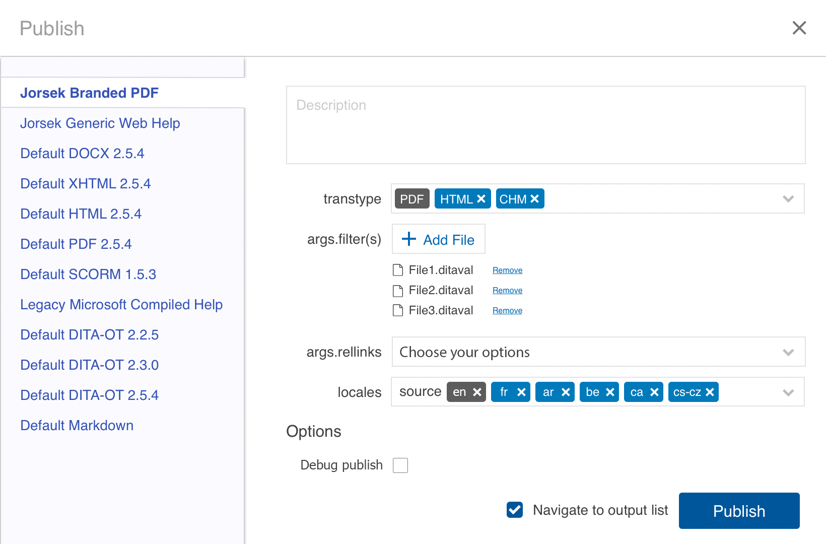
The publish scenario window.
The first screen when the publish button is clicked. It includes the following:
All available Publishing Scenarios, subsequently are displayed on the left panel.
The message on the right panel informs the user of the publishing process.
Document configuration window
“Visual hierarchy is key”
A clean appearance, without unnecessary elements.
Enhanced visual hierarchy, providing interactive setting options, to ensure the multi-selectable functionality.
Setup default screen
Setup screen with options
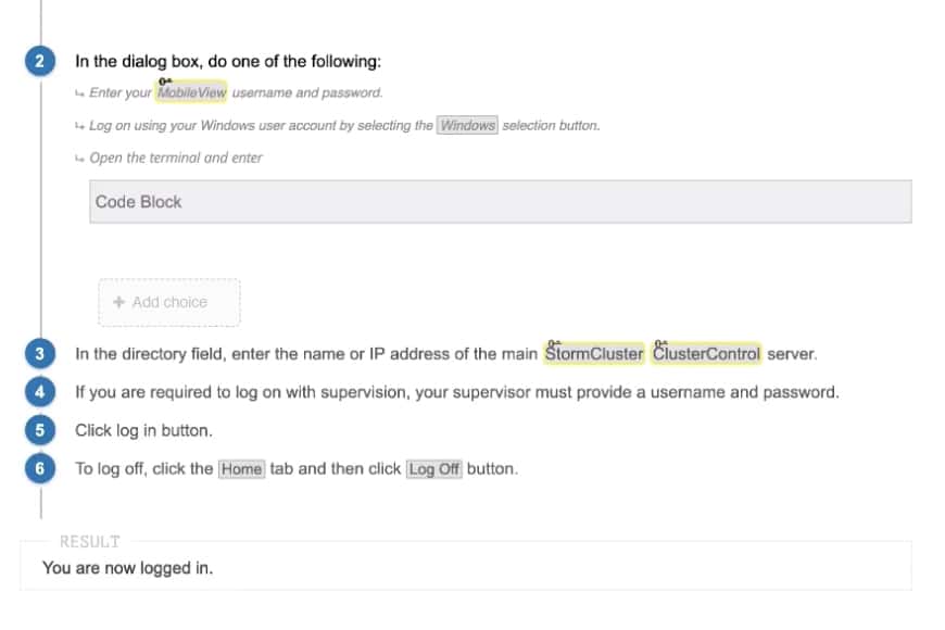
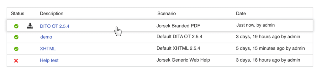
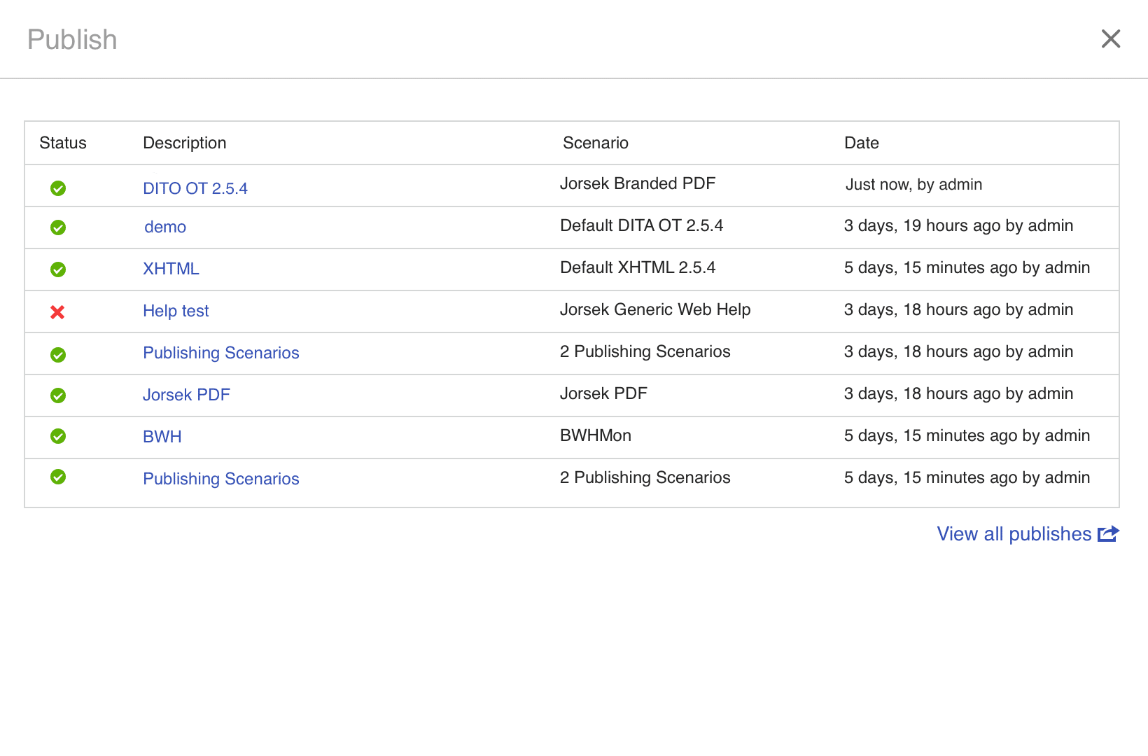
The Publishing activities window
Displays all published activities history, and link to the “Output” navigation tab in order to search for more publications.
Hovering over the publication row, the user can download the document or open the “Publish Record” window for more options.
New feature: The Publish Record window
An additional screen allowing the user more options within the selected publication. The Publish Record window includes:
The publishing description, parameters, options, and key assets.
Ability to download, republish, or delete the publication.
Ability to display the full path of the document before downloading the individual asset of the publication
Project Learnings
What I have learned from this project? User feedback vs. Team feedback The application itself is a complex content management system, and without UX research and user testing, the result will be a confusing and frustrating user experience. An intuitive experience is the ultimate goal for the user.